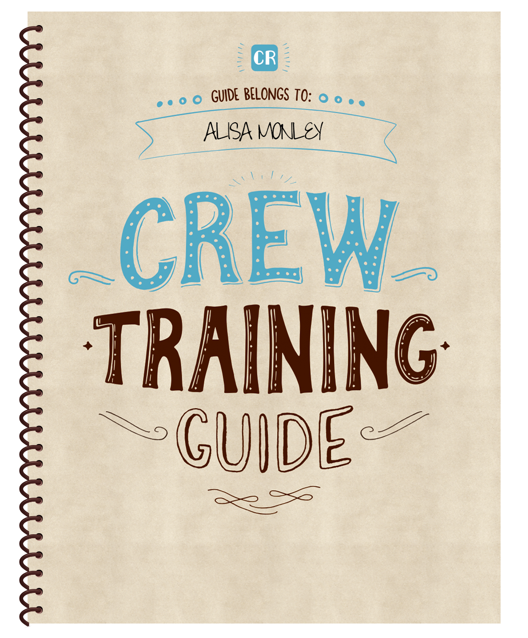
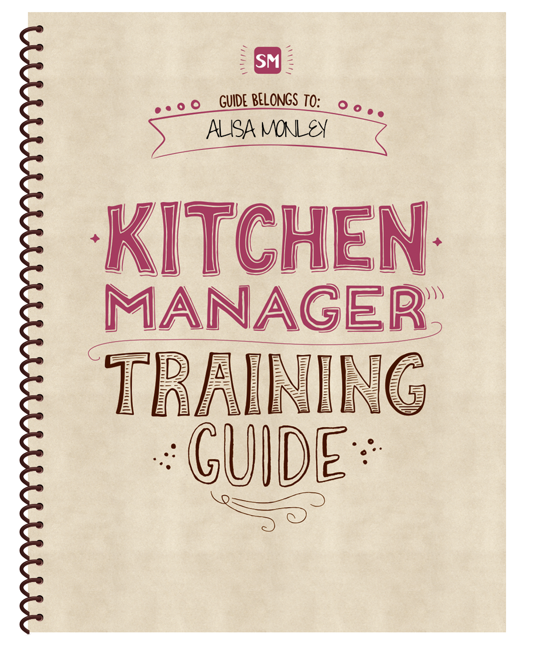
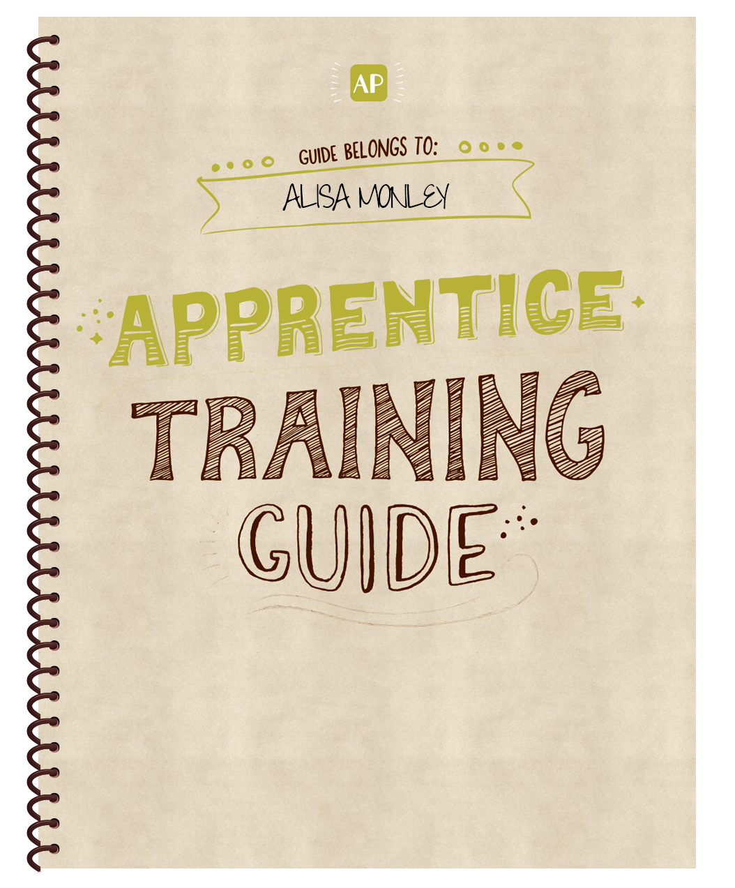
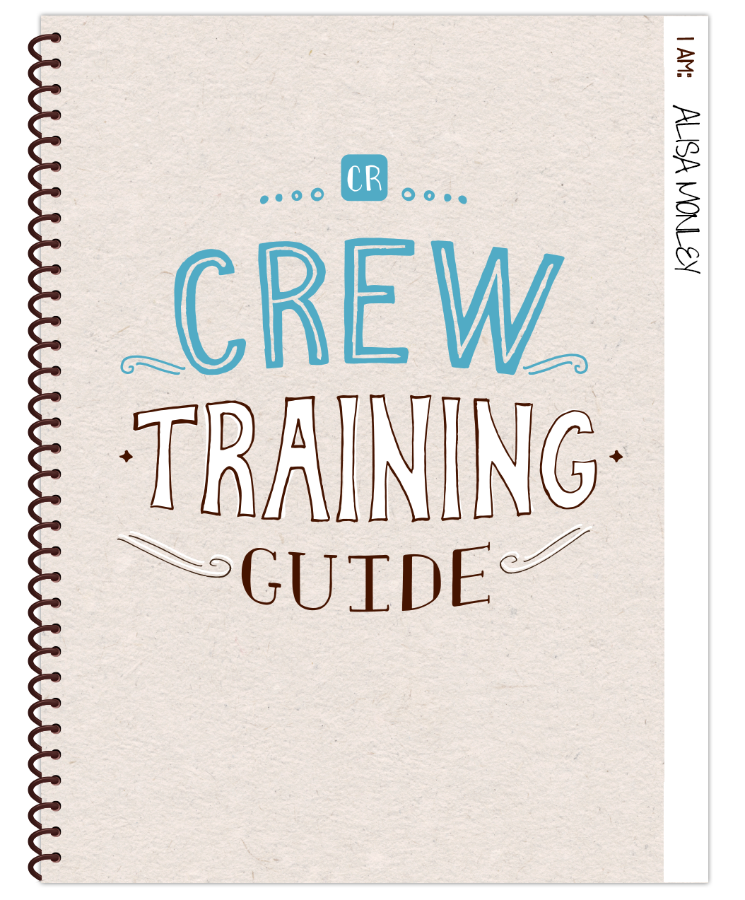
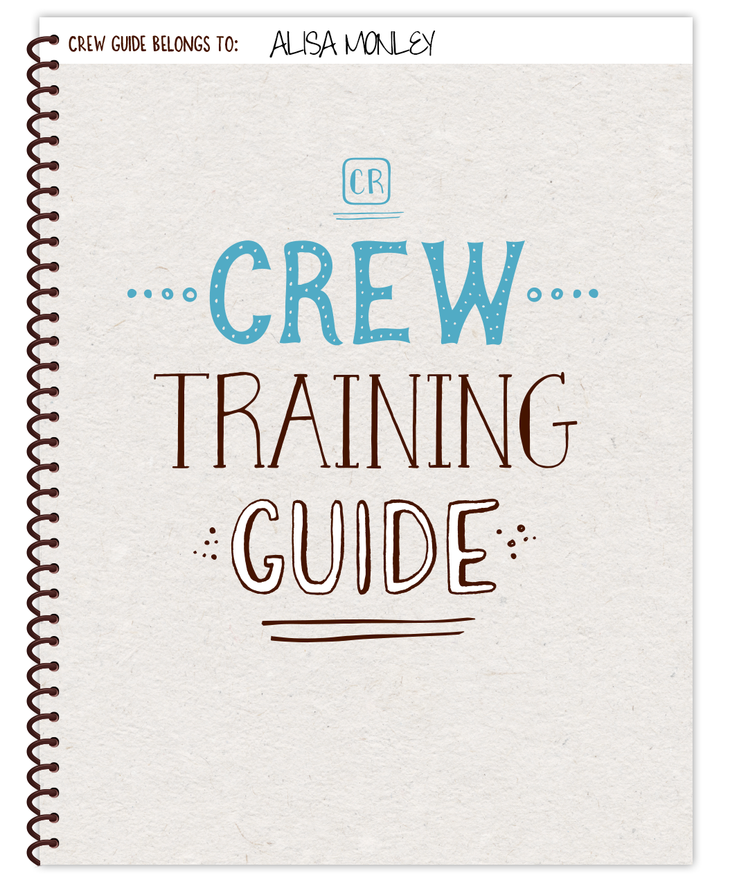
The grand re-brand of all of our training materials! This was a super creative project where I got really good at hand-lettering and digitizing drawn assets. Prior to this grand re-brand, our training materials had a very corporate look and feel which felt disconnected from the warm and whimsical nature of Chipotle's brand. The purpose of this project was to make our training materials look on-point with the brand and also improve them by making it easier to use, shorter and more concise! My wonderful team did a great job all around and the feedback from the field was great!
Station Training Guides
Spiral Bounds Notebook with Folders (for checklists)
Manager Training Guides
Spiral Bounds Notebook with Folders (for checklists)
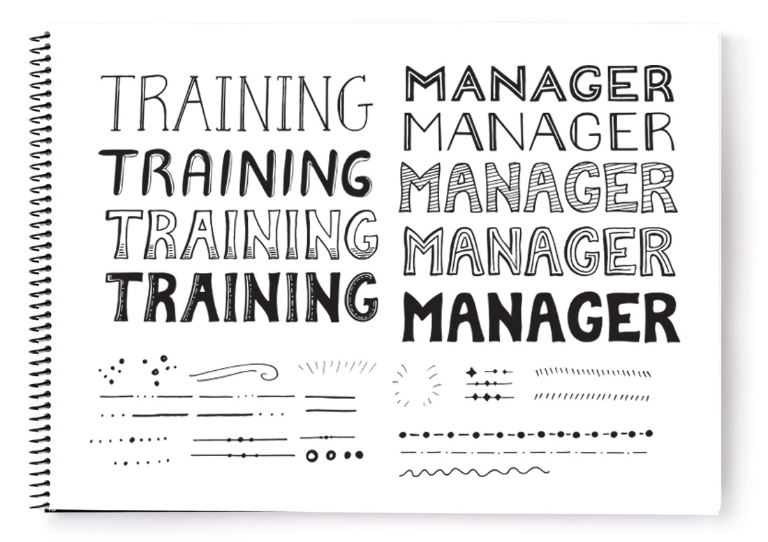
Wordmark Sketches
All lettering for the training guides was hand-drawn

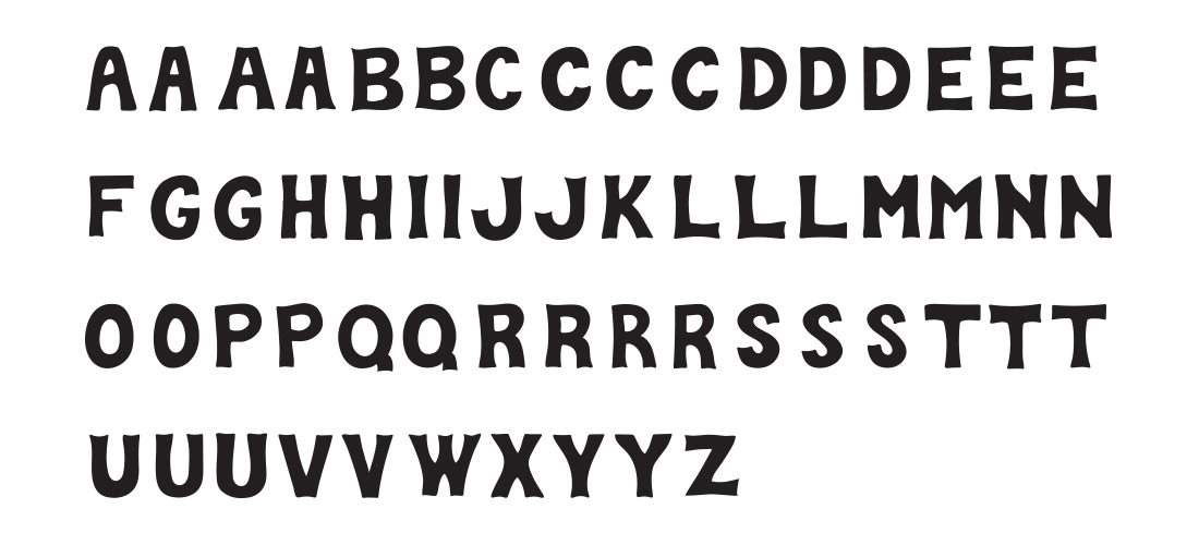
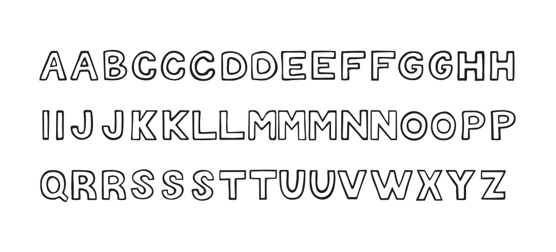
Big Chip Font
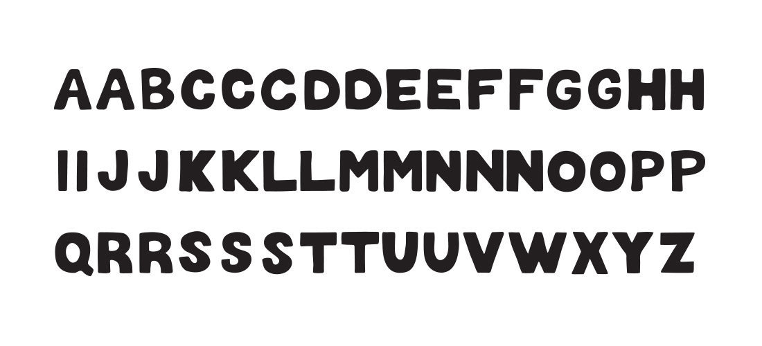
Custom Designed Font

Earlier Concepts
Here are some of the earlier training guide design ideas.
